A product label has a few seconds to do its job. On a crowded shelf, in a marketplace thumbnail or in a customer's hand, it has to say what the product is, who makes it and why it is worth picking up, before anyone reads a single word of fine print. Good product label design is what turns that quick glance into a sale, and poor design is what sends a shopper on to the next option.
The good news is that strong labels follow a handful of clear principles rather than any single trick. Below we walk through how to design a label that reads fast, fits the product and prints cleanly, whether you are launching a first product or refreshing packaging that has started to look dated. When you are ready to produce it, our sticker and label printing in Markham covers the formats, materials and finishes to bring the design to life.
Start With the Product, Surface and Buyer
To design a good product label, start before the design software. Measure the surface the label has to sit on, decide what information it must carry and picture the customer who will reach for it. Then build the look around those facts: a clear brand name and product identity, one or two legible fonts, a tight colour palette, and a material and finish suited to where the product lives. Design for how the label is seen and used, not just how it looks on screen.
Match the Design to the Container and Material
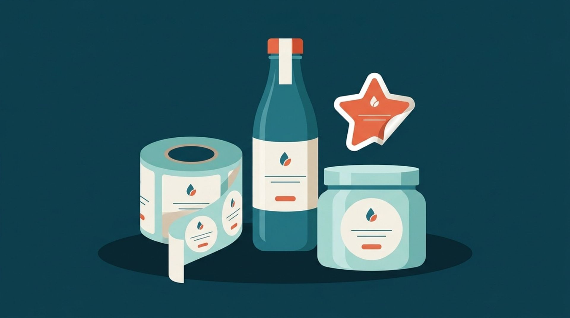
The container decides a lot about the label before you draw anything. Measure the flat area you actually have to work with, and watch for curves, shoulders, seams and recessed panels that can lift an edge or distort artwork. A tall bottle, a squat jar and a flat pouch each want a different shape and layout. It also helps to think about where the label sits at eye level, so the brand name and key information land in the first part a customer sees rather than wrapping out of view.
Design for Your Target Customer
A label that tries to appeal to everyone usually connects with no one. Picture the person most likely to buy, then let their expectations guide the style. A natural skincare line aimed at a calm, considered shopper leans toward soft tones, plenty of space and simple type. A sports or snack brand aimed at a younger buyer can go brighter and bolder. The same product can read as premium or playful depending on these choices, so decide the feeling first and let colour, type and imagery follow it.
Must-Have Elements on a Product Label
Before the creative choices, every label has to carry a core set of information. Getting these elements in and in the right order of importance keeps the design both compliant and easy to read.
Brand Name, Logo and Product Identity
Your brand name and logo should be the most recognizable part of the label, placed where the eye lands first and kept consistent with the rest of your branding. Close behind comes the product identity: what the item actually is, stated plainly. Shoppers should not have to guess whether they are holding a hand soap or a hand cream. Keep the wording short and let the visual design carry the personality, so the essentials stay clear at arm's length.
Barcodes, QR Codes and Legal Details
Function matters as much as looks. Leave room for a barcode if the product sells through retail, and keep it on a flat area with a quiet background so scanners read it first time. A QR code can link to your website, ingredients or a how-to video, which is useful when space is tight. Required details such as net quantity, ingredients, allergens and contact information also need a home. Plan these areas early so compliance does not crowd out the design later.
Colour, Typography and Layout That Read Fast
Once the content is set, the job of design is to make it readable in an instant. Colour, type and layout are the tools that guide a shopper's eye to the right place in the right order.
Fonts and Colours That Stay Legible
Stick to two typefaces at most, usually one for the product name and one for supporting text, and avoid thin or highly decorative fonts that fall apart at small sizes. Print a proof at actual size to check that the smallest text is still comfortable to read. Colour carries meaning too: cool tones tend to feel calm and trustworthy, warm tones feel energetic, and whatever palette you choose, keep strong contrast between text and background so the words hold up in shop lighting.
Visual Hierarchy and White Space
A clear hierarchy tells the eye what to read first, second and third. Make the product name the largest element, let the brand sit close behind, and step everything else down from there using size, weight and position. Resist the urge to fill every millimetre. Space around the key elements is not wasted; it makes a label look more considered and easier to scan. A calm, well-organized label reads as a more trustworthy product, which is exactly the impression you want on the shelf.
Choosing Label Materials and Finishes for the Job
A design only works once it is printed on the right stock. Material and finish change how a label looks, how it feels and how long it lasts, so the smart move is to match them to where the product will actually live rather than picking by appearance alone.
Matte, Gloss and Soft-Touch Finishes
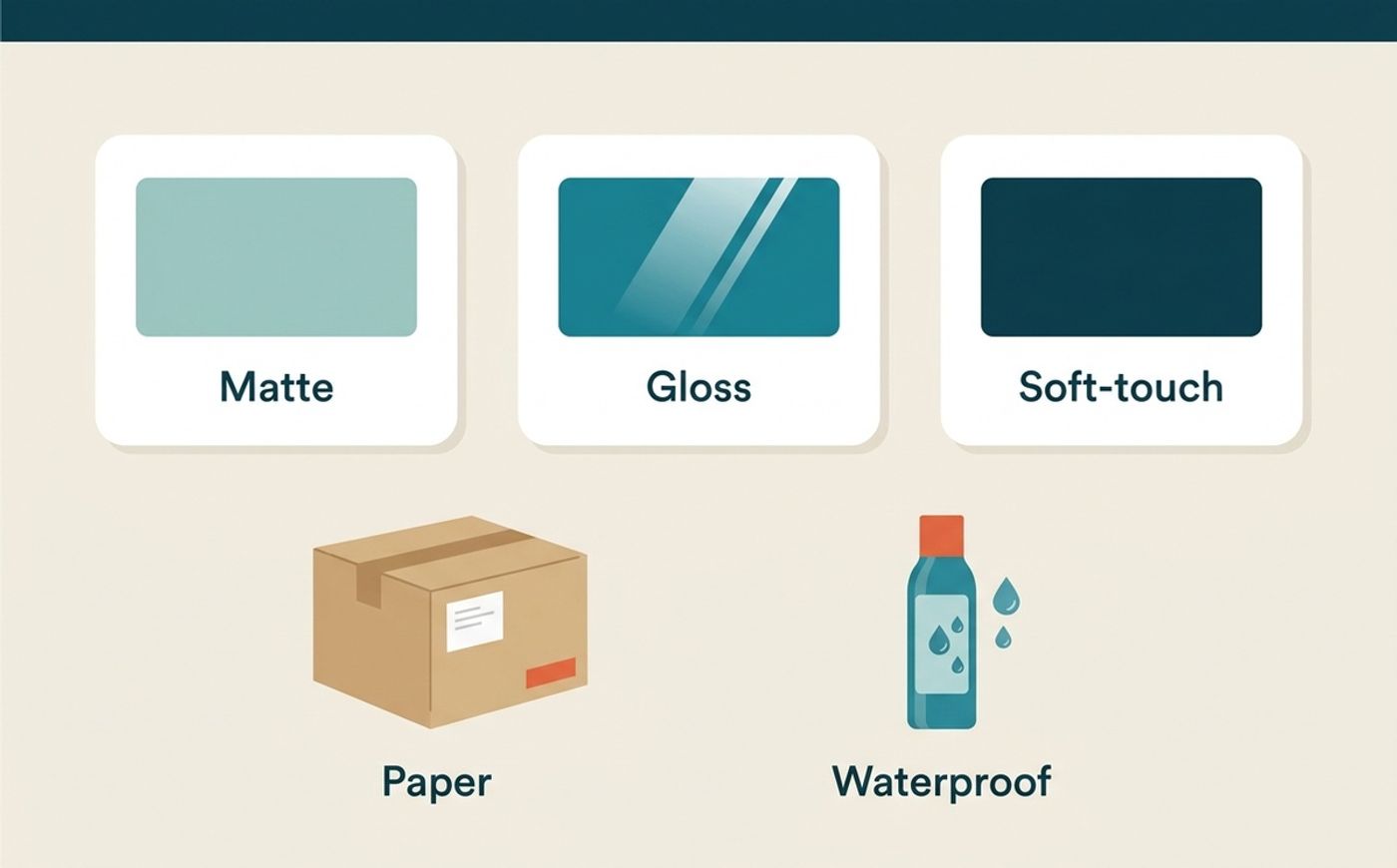
Finish sets the mood and the practicality. A matte finish looks clean and understated, resists fingerprints and is easy to read from any angle, which suits minimalist or premium branding. A gloss finish makes colours brighter and images pop, so it earns its place on vibrant, shelf-focused products. A soft-touch finish adds a velvety feel that reads as high end for cosmetics or specialty goods. If you are unsure, order a sample and judge the finish in hand before committing to a full run.
Paper vs Waterproof Labels and Stickers
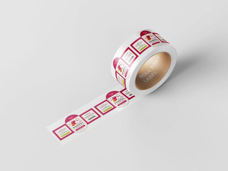
Material is about survival, not just looks. Paper-based labels are a sound, cost-conscious choice for dry goods kept indoors, such as candles, coffee or boxed items. Anything that meets moisture, oil, refrigeration or a lot of handling, like bottles, jars and bath products, is better served by a more durable waterproof option so the label does not wrinkle, smudge or peel. The same thinking applies to die-cut and kiss-cut stickers, where the cut style and backing affect how the piece is applied and handled. Tell our team where the product will be used and we can recommend the right material options.
Preparing Print-Ready Label Artwork
A beautiful label can still fail at print if the file is not set up for production. A few standard steps keep white slivers off the edges, keep type sharp and keep colour close to what you expect.
Bleed, Safe Zone and Cut Lines
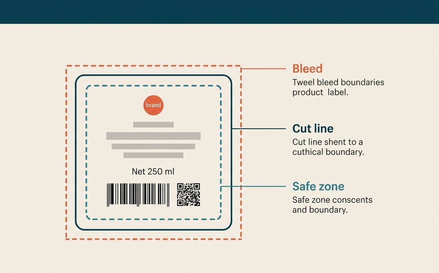
Three boundaries matter in every label file. The cut line is the finished edge of the label. Bleed extends any background colour or image about 1/8 inch (3 mm) past that edge, so a small shift during cutting never exposes a white gap. The safe zone keeps logos, text, barcodes and required information at least 1/8 inch (3 mm) inside the cut line, where nothing important is at risk of being trimmed. If your label has a custom shape, draw the cut line as its own clean path so the blade follows exactly where you intend.
Colour Mode, Resolution and File Formats
Build artwork in CMYK colour mode rather than RGB, since screen colours do not always translate to ink and CMYK keeps the printed result predictable. Any photos or textures should be 300 ppi at the final printed size so they stay crisp rather than soft. Keep logos and line art as vectors where you can. When a deadline is tight, sending clean, print-ready files speeds everything up, and rush printing is available for eligible label jobs. If you are not sure your file is ready, our team can walk you through what we need.
Design Mistakes and Canadian Labelling Rules
A few recurring slip-ups undo otherwise strong label design, and if you sell in Canada there are also content rules to plan for. Knowing both ahead of time saves a costly reprint.
Common Design Mistakes to Avoid
The most frequent problems are easy to prevent. Overcrowding is the big one: too many elements and the label stops communicating. Low-resolution logos or photos print blurry and cheapen the product. Thin borders placed right at the cut line look crooked after trimming, so move them inward or leave them out. Choosing a material that cannot handle the product's environment leads to peeling and smudging. And skipping a final proofread is how typos end up on a thousand printed labels. Check each of these before you approve the file.
Bilingual and Compliance Basics in Canada
Many prepackaged products sold in Canada have to show core information in both English and French, along with details such as the common name, net quantity, ingredient and allergen lists and dealer information. The exact rules depend on the product, so build space for required content into your layout from the start rather than squeezing it in at the end. The Canadian Food Inspection Agency publishes current requirements for food products; confirm what applies to yours before printing, since this is design guidance rather than legal advice.
With the design settled and the file print-ready, the last step is production. Share your size, quantity, material, finish and artwork status, and our team will recommend the right option and reply within one business day. You can send print-ready files or talk through the design with us, and finished labels are ready for pickup in Markham or delivery depending on the arrangement. When you are set, request a quote and we will help you get it printed.