People spend weeks on a business card design and about four seconds on the paper. Then the cards arrive, and the thing everyone actually comments on is how the card feels. Nobody says "nice kerning." They say "oh, this is a good card," and what they are reacting to is stock.
The good news is that this is a small decision with clear rules. There are three variables that matter, and once you know how they interact you can pick a stock in a couple of minutes. This guide walks through all three, and if you already know what you want, our business card printing in Markham covers every option below. If your card is part of a wider set with letterhead and envelopes, our stationery printing page is the better starting point, since the stocks should be chosen together.
What Is Business Card Paper Stock?
Before anything else, you need to know that printers describe paper in three different systems, and they do not convert cleanly into each other. This trips up almost everyone.
Points (pt) measure caliper, which is physical thickness. One point equals 0.001 inch. A 14pt card is 0.014 inch, or about 0.356 mm. A 16pt card is about 0.406 mm. A 32pt card is roughly 0.813 mm, which is close to the thickness of a credit card. Points are the most honest number when what you care about is how substantial the card feels.
GSM (grams per square metre) measures weight, not thickness. Business card stocks usually sit somewhere between 300 and 400 gsm. GSM is the standard outside North America and it is useful for comparing across paper types, but two papers at the same gsm can be noticeably different thicknesses depending on how dense the fibre is.
Pounds (lb) is the North American system, and it is the most confusing one, because the number refers to the weight of 500 sheets at that paper type's base size. That base size differs by paper type, which is why 100 lb text and 100 lb cover are completely different papers. If someone quotes you a pound figure, ask whether it is text or cover.
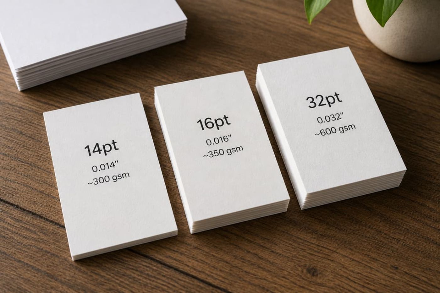
Rough guidance: 14pt lands in the neighbourhood of 300 gsm, and 16pt lands around 350 gsm or 130 lb cover. Treat those as approximations, not conversions. A cotton stock and a coated stock at the same gsm will feel nothing alike.
If you take one thing from this section: when you are comparing quotes between printers, compare points. It is the number that describes what you will actually hold.
14pt vs 16pt Business Cards: Which Thickness Should You Order?
This is the decision most business cards come down to, because these two cover the large majority of orders.
14pt is the industry standard. It is sturdy, it sits comfortably in a wallet, it takes gloss and matte coatings well, and it is the most economical option at volume. If you are ordering a thousand cards for a sales team, or you hand out cards constantly and they are essentially consumable, 14pt is the sensible choice. It is not a cheap option, it is a practical one.
16pt is only two points thicker, which does not sound like much, but the difference is easy to feel side by side. A 16pt card is stiffer, resists bending in a pocket, and holds its corners better over time. For most small businesses handing out a few hundred cards a year, the price difference is small enough that 16pt is worth it.
Our honest recommendation for most clients: 16pt is the default worth paying for, 14pt is the right call when quantity matters more than feel. If you are ordering fewer than about 500 cards, the difference in total cost between the two is usually not the thing that decides your budget.
One thing worth understanding, because most guides get it backwards: finish can close the gap. A 14pt card with a soft touch laminate often feels more expensive than a 16pt card with a basic gloss coating. Thickness and finish work together. If you have to choose where to spend, a good finish on a standard stock usually beats bare thickness.
Coated vs Uncoated Business Card Stock: What Actually Changes
This is a bigger decision than thickness, and it changes more than the look.
Coated stock has a clay coating on the surface. Ink sits on top of that coating rather than soaking in, so colours stay saturated and photographs reproduce sharply. If your card has a full colour photo, a dark solid background, or a brand colour that has to be exact, coated is the correct choice.
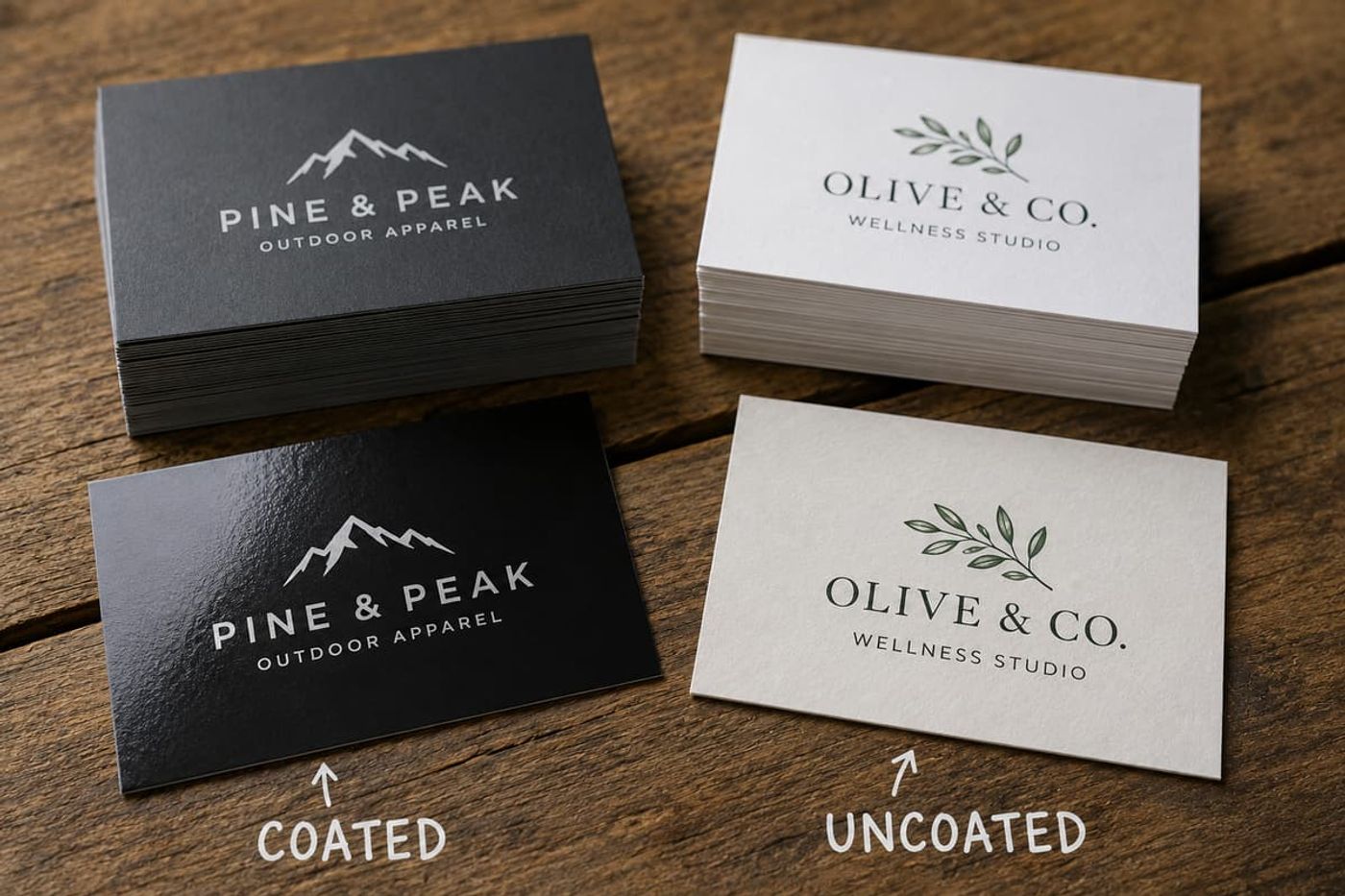
Uncoated stock has no coating, so ink soaks into the fibre. That produces a softer, slightly muted result and a natural, tactile surface. Uncoated is what letterpress cards, cotton stocks and kraft cards are. It reads as understated and considered rather than glossy and commercial.
Two practical consequences that most guides skip:
Dot gain. On uncoated stock, ink spreads slightly as it soaks in, which means fine detail thickens and mid-tones darken a little. It is not a defect, it is how the paper behaves. If your logo has hairline rules or type below about 6pt, it will look heavier on uncoated than it does on your screen. Design accordingly or stay coated.
Colour shift. The same CMYK values print noticeably darker and less vivid on uncoated stock. If your brand colour is a bright blue or a vivid green, it will lose some punch. If exact colour matching matters, ask for a proof on the actual stock rather than approving from a screen.
Matte, Gloss and Soft Touch Finishes Compared
Finish is applied on top of a coated stock, and it is where most of the perceived quality comes from.
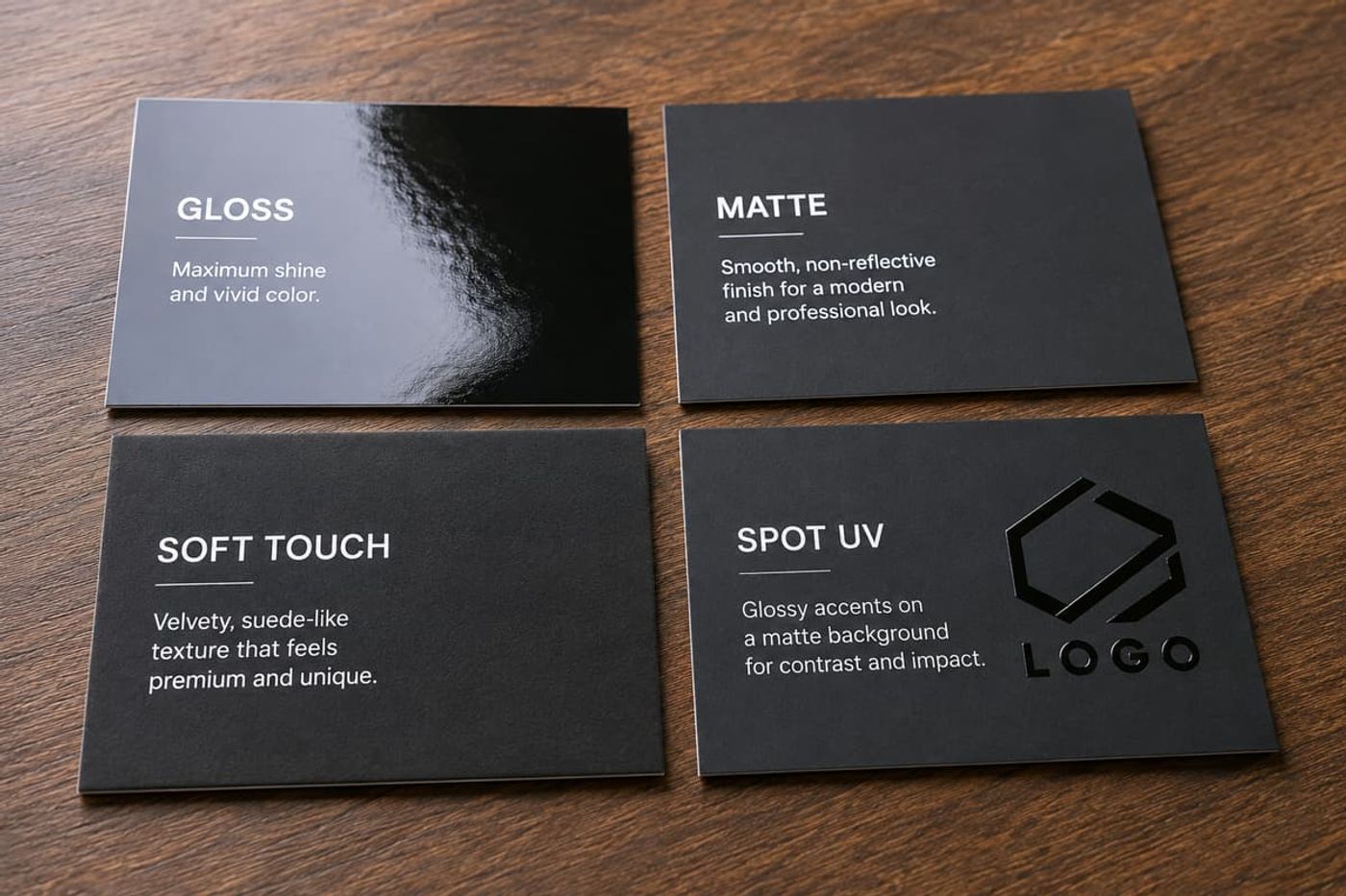
Gloss gives maximum shine and the most vivid colour. It is the right choice for photography and bold, colourful branding. The tradeoffs are glare under overhead lighting and visible fingerprints, and you cannot reliably write on it.
Matte is smooth and non reflective. It reads as modern and professional, it does not glare, and fine type stays legible. Colours are slightly less punchy than gloss. This is the most commonly requested finish for a reason.
Soft touch laminate is a film with a velvety, almost suede texture. It is the finish people notice most and the one that most reliably reads as premium. It also adds real protection to the card. The catch: on dark solid colours, soft touch and matte laminates both show scuffs and scratches from handling, and a black soft touch card that has been in a wallet for a month will show it.
Spot UV is a gloss varnish applied only to selected areas, so your logo shines against a matte background. It is a genuinely striking effect and it is one of the cheapest ways to make a card look expensive. It needs a separate file layer to tell the press where the varnish goes, so plan for it at design stage rather than asking for it after the artwork is approved.
That scuffing point is worth repeating because it is the most common regret we see. If your card is a solid dark colour, either accept that it will show wear, choose a lighter background, or discuss the finish with us before you commit.
Premium Business Card Stock
Above 16pt, you are into cards that are making a statement about the card itself.
18pt to 22pt is a noticeable step up in rigidity without going to an extreme. It is the range where embossing, foil stamping and debossing start to work well, because those techniques need enough substance to hold their shape.
32pt is unmistakable. It is roughly credit card thickness and it essentially cannot be bent by hand. It works for luxury services, high end real estate, and anyone who gives out relatively few cards and wants each one to land. Two honest caveats: it costs meaningfully more, and it does not fit comfortably in every wallet card slot. If you are considering it, print a small batch first and carry a few for a week.
Specialty constructions include duplex stock, where two sheets are laminated together, often with a coloured core so the card shows a stripe on the edge. Painted edges, where the cut edge is coloured, work on thick stock and are visually distinctive. Cotton and linen stocks bring texture rather than thickness. Kraft stock reads as natural and works for certain brands, though it limits colour reproduction significantly.
A realistic note: specialty stocks and finishes usually carry minimum quantities and longer lead times, because they are ordered in rather than kept on the shelf. If you are planning a specialty card, allow time. If your deadline is short, see the section below.
Can You Write on Your Business Card? The Test Most People Skip
For a surprising number of businesses this is the deciding factor, and almost every guide treats it as a footnote.
If anyone in your business writes on the card, an appointment time, a price, a reference number, a name, then you need a stock that takes pen ink. That rules out gloss immediately. Glossy coated surfaces reject most gel and rollerball inks and smear for a long time before they dry, if they dry at all. Ballpoint does better on coated stock than gel, but it is still not reliable.
Uncoated stock is the right answer. Ink absorbs, it dries immediately, and it does not smear. Matte is a reasonable middle ground, better than gloss but not as good as uncoated.
A common and sensible compromise: coated and finished on the front where the design lives, uncoated on the back where people write. Not every printer offers it, but it solves the problem cleanly. This matters most for clinics, salons, trades, tutors, and anyone who books a next appointment on the spot.
How Paper Stock Changes Your Business Card Design File
The stock decision should happen before the design is finished, not after, because it changes what you should be putting in the file.
- Standard trim size is 3.5 x 2 inches, with 0.125 inch of bleed on all four sides and all text kept at least 0.125 inch inside the trim. That applies to every stock.
- Fine type and hairline rules need coated stock. On uncoated, they thicken.
- Full bleed dark backgrounds need a laminate rather than a coating, and even then will show handling on matte or soft touch.
- Spot UV, foil and embossing each need their own layer in the file, usually as a 100 percent black mask on a separate layer, telling the press exactly where the effect goes. This is not something a printer can infer from your artwork.
- Rounded corners change nothing about size but do need to be specified at quote stage, since they are a separate die.
- Colour should be CMYK, not RGB, and it should be judged on a proof rather than a monitor, particularly on uncoated stock.
If you want the full bleed and safe area logic in more detail, our guide to standard flyer sizes covers the same three boundaries with diagrams that apply to any print piece.
Best Business Card Paper Stock by Type of Business
A shortcut, based on what we actually print for people in Markham.
- Trades and contractors. 16pt matte. It survives a truck, a tool bag and a work pocket, and it takes a pen if you write a quote figure on it.
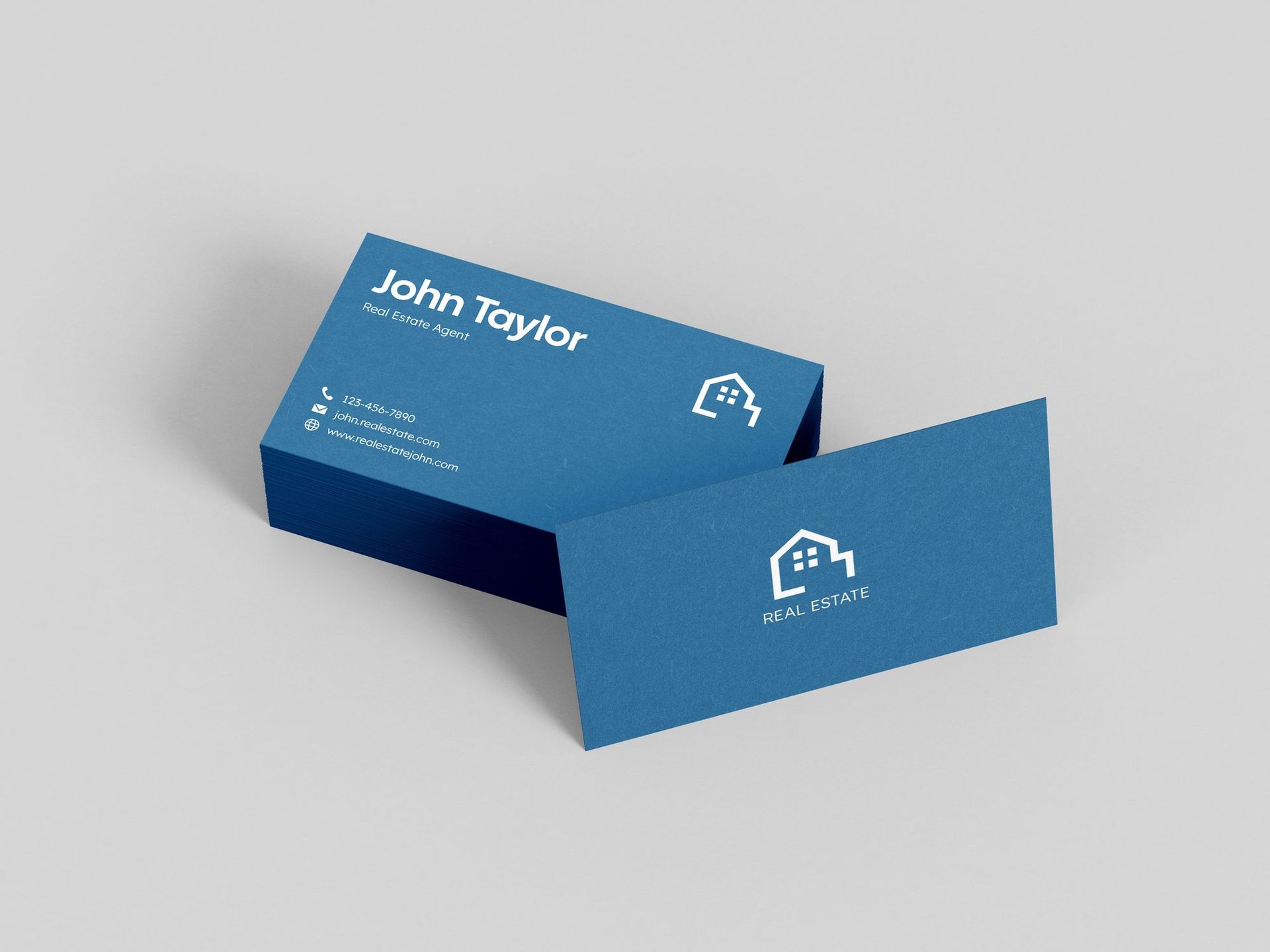
- Real estate. 16pt gloss or matte, ordered in volume. High handout rate, so per unit cost matters, but the card has to survive an open house.
- Clinics, salons, dental, therapy. Uncoated, or coated front and uncoated back. Appointment writing is the whole job.
- Restaurants and cafes. 14pt or 16pt gloss. Food photography needs a coated stock to look appetizing.
- Consultants, law, finance. 16pt soft touch or a cotton uncoated stock. Low volume, high stakes per card.
- Design, architecture, creative. This is where 18pt and up, duplex stock, painted edges and letterpress earn their cost, because the card is a work sample.
- Startups on a budget. 14pt matte. Perfectly professional. Spend the money on the design instead.
Choosing Business Card Stock on a Deadline
If you need cards this week, the honest answer is that your stock options narrow.
Standard coated stocks in 14pt and 16pt, with gloss or matte, are what a print shop keeps on hand. Those can move fast. Soft touch laminate is usually available quickly too. Specialty stocks, cotton, kraft, coloured core duplex, anything above about 18pt, and finishes like foil or letterpress generally have to be ordered or set up, which adds days.
So if the trade show is Friday, plan on 16pt matte and a good design, and treat the specialty card as the next order. Our rush printing page covers what is realistically achievable on a short turnaround, and it is worth calling rather than guessing, because it depends on what is on the shelf that week.
Common Business Card Stock Mistakes
Choosing the stock after the design is finished. Coated versus uncoated changes how your colours and type reproduce. Decide first.
Approving colour from a screen. Especially on uncoated. Ask for a proof.
Dark solid backgrounds on matte laminate. They scuff. If you love the look, know what you are signing up for.
Gloss on a card people write on. The ink will not dry.
Assuming thicker is automatically better. A 32pt card that does not fit a client's wallet is worse than a 16pt card that does.
Not asking to feel the paper. This is the one that costs the most and is the easiest to fix. Paper is a tactile decision and no photograph or web description substitutes for holding a sample. Come in and touch the options.
Common questions
Not sure which stock fits your brand?
Send us your design and quantity — we’ll recommend a paper and finish with the quote.